


Your website is getting traffic. Maybe from Google, maybe from ads, maybe from social media. But the enquiries aren't coming. The phone isn't ringing. The contact form sits empty.
Sound familiar? After auditing over 100 Singapore business websites, we've identified the same 10 mistakes appearing over and over. Some are obvious. Some are subtle. All of them are costing you customers right now; and most can be fixed in a few days, not months.
1. Your site takes more than 3 seconds to load
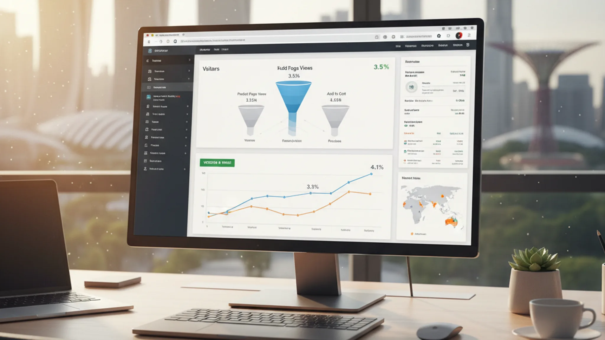
This is the big one. A one-second delay in load time can reduce conversions by 7%. If your site takes 5 seconds to load, nearly 40% of visitors leave before they see a single word of your content.
Run your site through Google PageSpeed Insights right now. If your mobile score is below 50, your site is actively losing you money.
Common culprits: uncompressed images (use WebP, not PNG), too many plugins, cheap shared hosting, heavy JavaScript animations, and oversized hero videos nobody watches. Many of these issues trace back to bargain-tier builds that prioritise low cost over quality; understanding what different website designer price tiers actually deliver can help you avoid this trap from the start. When we rebuilt Perfect Style Salon's site, load time dropped from 5.8s to 2.4s; and enquiries jumped 180%.
2. It's not mobile-friendly (or barely mobile-friendly)
Over 70% of web traffic in Singapore comes from mobile devices. If your site's text is too small to read, buttons too close together, or images overflow the screen, you're telling 7 out of 10 visitors to go elsewhere.
"But we're responsive!" doesn't cut it. Pull up your website on your phone right now. Try to:
- Read all the text without zooming
- Tap every button with your thumb without hitting the wrong one
- Fill in your contact form without frustration
- Find your phone number and tap to call
If any of those failed, your "responsive" site has a mobile problem. And Google knows: mobile-first indexing means your mobile experience directly determines your search rankings.
3. No clear call-to-action
Visitors land on your homepage. It looks nice. But what are they supposed to do? If the answer isn't immediately obvious, they leave.
Every page on your website should have one primary call-to-action (CTA) that's visible without scrolling:
- Homepage: "Get a Free Quote" or "View Our Services"
- Service pages: "Book a Consultation" or "Contact Us"
- Blog posts: "Read Our Guide" or "Talk to an Expert"
The CTA should be a button, not a text link buried in a paragraph. It should use action language ("Get Your Quote" beats "Submit") and it should contrast visually against the rest of the page. If your CTA doesn't look like the most clickable element on the page, it's not doing its job.
4. Too many navigation options
Navigation menus with 15+ items, dropdown menus three levels deep, and footer links to every page on your site: all of it creates decision fatigue. When visitors face too many choices, they choose none.
Effective navigation has 5–7 primary items. That's it. Everything else gets organised under those categories or removed entirely. Your navigation should answer one question: "What do most visitors need to find?" Not "What are all the pages on our site?"
We've seen contact form submissions increase by 25–35% after simplifying navigation and adding a persistent CTA button. Less clutter means clearer paths to conversion.
Recommended reads
5. Generic stock photos everywhere
Your website has a photo of two people shaking hands in a conference room. And another of someone typing on a laptop. And maybe a diverse group high-fiving. Your visitors have seen these exact images on 50 other websites. They don't build trust — they signal "we couldn't be bothered to show you who we actually are."
Solutions that work:
- Real photos of your team, office, and work: even phone photos are better than generic stock
- Client project photos: show your actual work, not someone else's
- Custom illustrations or AI-generated images: unique visuals that match your brand
Authentic imagery builds trust. Trust converts. It's that simple.
6. No social proof
A study found that pages with social proof increase conversions by up to 34%. Yet most Singapore SME websites have zero testimonials, zero reviews, and zero evidence that anyone has ever used their service.
What to add:
- Google review widget: show your rating and recent reviews directly on your site
- Client testimonials: real names, real companies, specific results. "Great service!" means nothing. "Enquiries increased 180% after the redesign" means everything
- Client logos: even 4–5 recognisable logos in a "Trusted By" section adds credibility
- Case studies: show the problem, your solution, and the measurable result
We include portfolio case studies with specific metrics: like Arcade Rental's #1 Google ranking and MET Interior's 3x lead increase; because vague claims don't convert. Numbers do.
7. Contact information is hidden
A study found that 93% of small business websites don't display a contact email on the homepage, and 49% don't list a phone number. That's astonishing — and it's costing those businesses leads every day.
Your contact information should be:
- Visible in the header or footer of every page
- Clickable: phone numbers should use
tel:links, emails should usemailto:links, and WhatsApp should link directly to your chat - On a dedicated Contact page with a simple form (3–4 fields max), your address/map, and all communication channels
In Singapore, WhatsApp is a primary business communication channel. If you don't have a WhatsApp click-to-chat button on your site, you're missing the way most customers prefer to reach out.
8. Your content talks about you, not your customer
"We are a leading provider of innovative solutions..." Stop right there. Your visitors don't care about your mission statement. They care about their problem and whether you can solve it.
Rewrite every page from the customer's perspective:
- Instead of: "We provide comprehensive web design services"
- Try: "Get a website that generates leads while you sleep"
- Instead of: "Our team has 20 years of combined experience"
- Try: "We've helped 100+ Singapore businesses grow online, here's how we can help yours"
Use "you" and "your" more than "we" and "our." Lead with benefits, not features. Answer the question every visitor is silently asking: "What's in it for me?"
9. No blog or fresh content
A website with five static pages and no updates gives Google nothing new to index. It signals that your business is either inactive or doesn't have expertise worth sharing. Both hurt your rankings.
You don't need to blog daily. Even one well-written, SEO-optimised post per month can make a significant difference. Each post is a new page that can rank for a new keyword, attract new visitors, and demonstrate your expertise to both Google and potential customers.
Our SEO guide and first page of Google guide consistently bring in organic traffic months after publication. That's the power of content that's written with a purpose, not just to fill a blog feed.
10. No HTTPS or outdated security
If your website URL starts with "http://" instead of "https://", Google Chrome displays a "Not Secure" warning to every visitor. That warning destroys trust instantly — especially for businesses that handle customer data, payments, or personal information.
SSL certificates are free via Let's Encrypt. There's no excuse for not having HTTPS in 2026. If your hosting provider charges extra for SSL, switch providers.
Beyond SSL, check for outdated CMS versions, unpatched plugins, and exposed admin login pages. A security breach takes your site down and can take your reputation with it.
Here's the good news: most of these mistakes are fixable. Some take an afternoon (adding HTTPS, simplifying navigation, adding CTAs). Others require a more thorough approach (speed optimisation, mobile redesign, content strategy). But every fix moves the needle on your conversion rate.
If you spotted three or more of these issues on your own website, it might be time for a strategic redesign rather than patching problems one by one. We've helped Singapore businesses transform underperforming websites into lead-generating machines: like Perfect Style Salon's 180% enquiry increase and MET Interior's 3x jump in leads.
Want to know exactly what's wrong with your site? Get a free website audit, we'll identify every issue and prioritise the fixes by impact. No commitment, just honest feedback.
Sources & References (1)

Written by
Terris
Founder & Lead Strategist
Terris has over 8 years of experience designing high-converting websites for Singapore businesses. From luxury brands to SMEs, he combines aesthetic design with strategic thinking to deliver websites that drive real business growth.
Want to see these strategies in action? Browse our portfolio or get in touch to discuss your project.